본 포스트에서는 Model-Agnostic Method중 하나인 Individual Conditional Expectation(ICE)를 이용하여 iris 데이터를 학습한 Neural Network 에 적용해보도록 하겠습니다.
Individual Conditional Expectation(ICE) 설명
Individual Conditional Expectation(ICE)는 Model-Agnostic Method 중 하나로 학습된 모델을 가지고 데이터셋을 특정 feature들을 변환하면서 바뀌는 모델 출력값들을 모두 그리면서 모델을 해석하는 방법입니다. 즉, 하나의 선이 하나의 인스턴스가 되고, 이 선들의 평균이 PDP가 됩니다.
예를 들어 iris 데이터를 가지고 학습한 모델에 iris데이터의 모든 instance에 대해 꽃받침의 길이를 최솟값부터 최댓값까지 변환하면서 바뀌는 모델의 softmax 값을 가지고 모델을 해석합니다.
그러면 이제 iris 데이터와 학습된 모델을 가지고 ICE를 그려보도록 하겠습니다.
필요 라이브러리 import 및 iris 데이터, 학습한 모델 불러오기
import tensorflow as tf
import numpy as np
import matplotlib.pyplot as plt
%matplotlib inline
from sklearn.datasets import load_iris

iris_dataset = load_iris()
model = tf.keras.models.load_model('iris_model.h5')

target_names = iris_dataset['target_names']
feature_names = iris_dataset['feature_names']
해당 내용은 PDP 챕터와 같습니다.
Individual Conditional Expectation(ICE) 그리기
plt.figure(figsize=(15,20))
color_list = ['r-', 'g-', 'b-']
plt_term = 100

for feature_idx in range(len(feature_names)):
    tmp_data = np.copy(iris_dataset['data'])
    index = np.linspace(min(tmp_data[:, feature_idx]), max(tmp_data[:, feature_idx]), plt_term)
    results = []
    for i in index:
        tmp_data[:, feature_idx] = i
        result = model.predict(tmp_data)
        results = np.c_[results,result] if len(results) else result

    for target_idx in range(len(target_names)):
        plt.subplot(4,3,(3*feature_idx) + target_idx + 1)
        plt.xlabel(feature_names[feature_idx])
        plt.ylabel('softmax')
        plt.title(target_names[target_idx])
        for row in range(len(results)):
            plt.plot(index, results[row, [3*n + target_idx for n in range(plt_term)]], color_list[target_idx], linewidth=0.1)
            plt.ylim(0,1)
ICE를 그리는 코드는 위와 같습니다. 각 feature를 돌면서 각 feature의 최솟값 부터 최댓값 까지 값을 변환하면서 모델의 softmax 값들을 수집합니다. 수집한 데이터를 가지고 setosa는 빨간선, versicolor는 초록선, virginica는 파란선으로 각각 다른 plot을 만들어 그려줍니다.
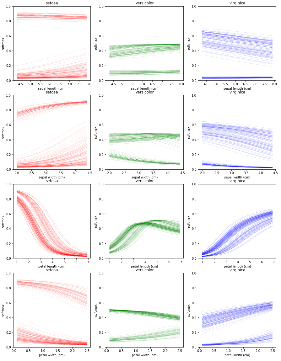
ICE 플랏을 보면 꽃잎의 길이 특징을 제외한 나머지 플랏에 대해서 선들이 두 가지 양상으로 나뉘는 것을 볼 수있습니다. 이런 현상에 대해 인스턴스의 피쳐사이에 Heterogeneous relationship이 있다고 표현합니다. PDP에서는 평균을 취했기 때문에 이를 확인할 수 없었지만 ICE는 각 인스턴스별로 선을 그려주기 때문에 이런 양상을 확인할 수 있습니다.
그리고 ICE도 PDP와 마찬가지로 꽃잎의 길이가 짧아지면 setosa로 예측할 경향이 높아지고, 길어지면 반대로 낮아지는 것을 알 수 있습니다.
ICE 플랏은 각 인스턴스별로 선이 하나씩 생기기 때문에 만약 선의 초기 위치(플랏에서 선의 가장 왼쪽 점)가 많이 다르다면 모델의 경향을 파악하기 어려운 점이 있습니다. 이를 보완하기 위해서 선들의 초기위치를 하나로 맞춰주는 작업(Centered ICE)을 해줄 것 입니다.
Centered ICE 그리기
plt.figure(figsize=(15,20))
color_list = ['r-', 'g-', 'b-']
plt_term = 100

for feature_idx in range(len(feature_names)):
    tmp_data = np.copy(iris_dataset['data'])
    index = np.linspace(min(tmp_data[:, feature_idx]), max(tmp_data[:, feature_idx]), plt_term)
    results = []
    for i in index:
        tmp_data[:, feature_idx] = i
        result = model.predict(tmp_data)
        results = np.c_[results,result] if len(results) else result

    for target_idx in range(len(target_names)):
        plt.subplot(4,3,(3*feature_idx) + target_idx + 1)
        plt.xlabel(feature_names[feature_idx])
        plt.title(target_names[target_idx])
        for row in range(len(results)):
            if row==0 : mean = np.mean(results[:,target_idx])
            plt.plot(index, results[row, [3*n + target_idx for n in range(plt_term)]] - (results[row,target_idx] - mean),
                     color_list[target_idx], linewidth=0.1)
            plt.ylim(0,1)
Centered ICE는 ICE에서 모든 선들의 초기 위치를 평균 값으로 고정해주었습니다. 이외에는 ICE와 모두 동일합니다.
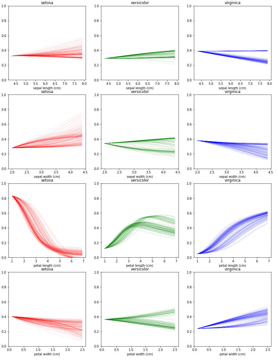
Centered ICE는 모든 선들의 초기 위치를 평균 값으로 고정해주었기 때문에, 이제 세로축 값은 softmax로 볼 수 없지만 그 경향을 파악할 수 있습니다. 마찬가지로 꽃잎의 길이를 제외한 값에 대해서는 모델이 둔감하게 변화하는 것을 알 수 있습니다.